Get A Perfect Poster Design For Your Brand- Here’s How?
Posters or the Flyers have always been an inseparable part of the brand promotional techniques. And almost all businesses till date has designed their brand posters and some or the other point be it for self-promotion or for a client, large posters are one of the fun ways to present a message to many audiences and to do some interesting things with the design.
Generally, the poster design starts with a common canvas and can be designed vertically or horizontally. But most commonly, the large posters are designed keeping in mind the vertical orientation. The common poster sizes are 8.5 by 11 inches, 11 by 17 inches and 22 by 34 inches and the large format posters are commonly of the size24 by 36 inches.
Generally, the poster design starts with a common canvas and can be designed vertically or horizontally. But most commonly, the large posters are designed keeping in mind the vertical orientation. The common poster sizes are 8.5 by 11 inches, 11 by 17 inches and 22 by 34 inches and the large format posters are commonly of the size24 by 36 inches.
Let us take a look at these useful tips for improving your next digital poster design to make it beneficial from the business point of view:
Make it readable from a distance:
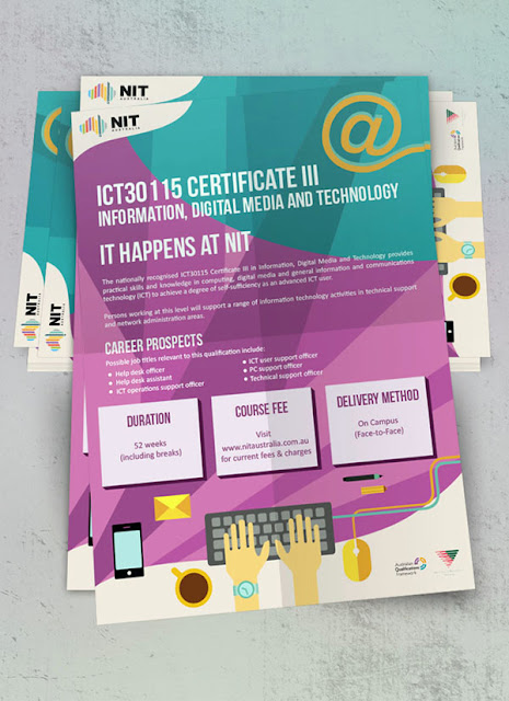
The key information about your brand should be easily readable from a distance in order to draw the attention of people to the poster and make sure you create a hierarchy in the text. While designing your brand’s poster consider these three below listed distinct layers so that your flyer look organised. Consider using a headline, basic details and the fine print.
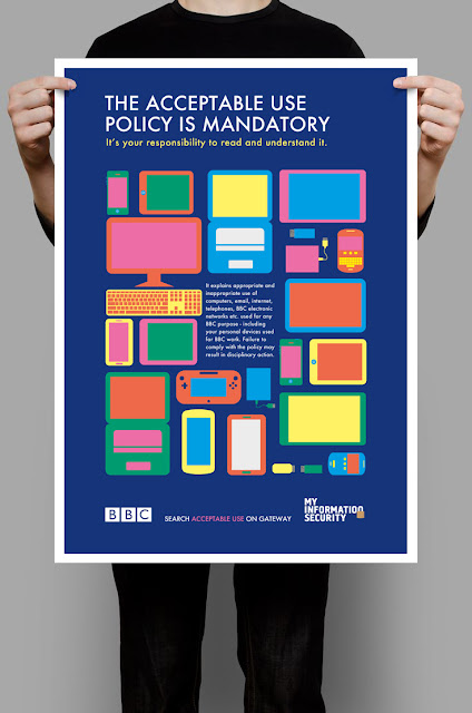
Amp up the contrast:
Every brand has only a single chance to grab someone’s attention and therefore using a high contrast between the elements is a good tactic to do so. Choose bold colours, try typeface or opt for a colour palette that is bit much crazy as compared to other projects. You can ask your designers to start on a white canvas and after the design is ready to try adding colours to its background that are attractive enough and can make your poster stand out from the rest.
Consider size and location:
Where your brand’s poster is decided to be located? Knowing the answer to this question will help you make choices about how to create it. Along with the visual contrast, the external factors are equally important within your design. Whatever background you choose, make sure that it does not blend into the environment.
Make a mini version:
The mini versions of the poster design are considered for using them in other places as well. There is a marketing principle that is used by most of the brands already and you should also consider the one in your marketing tactics as well. The principle states that a person needs exposure to something 20times at least to remember. Try placing your brand’s posters at many places so that you can accomplish that principle.
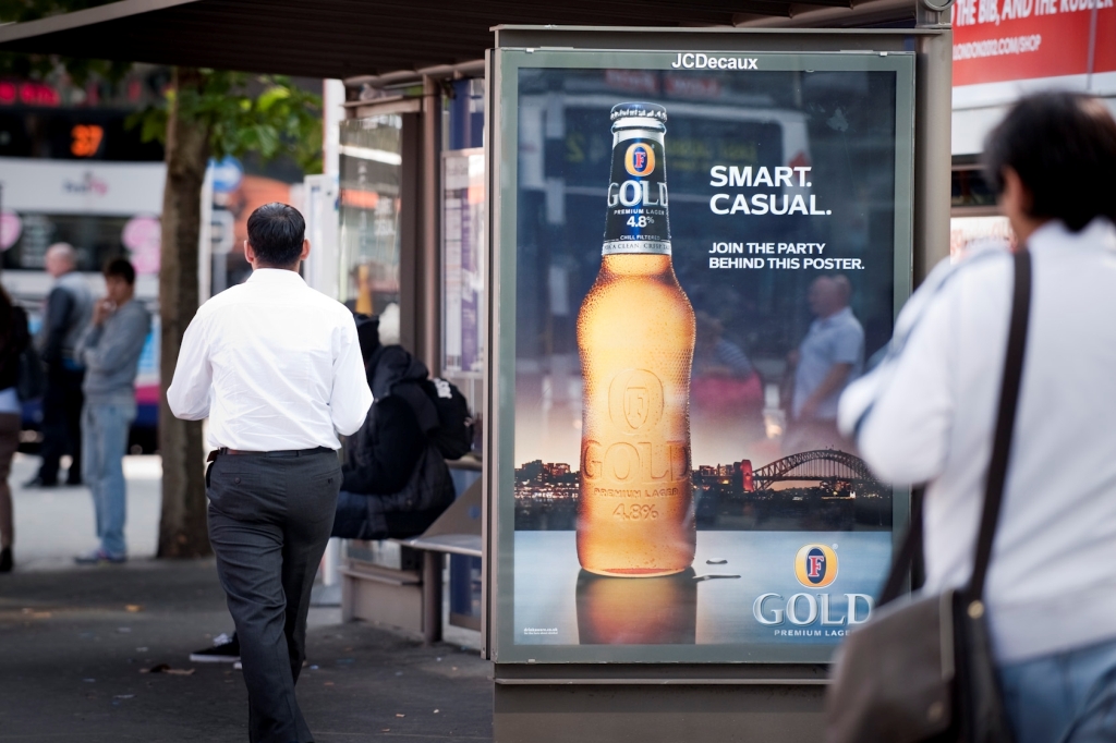
Use one big visual:
Use at least one big visual in your poster design that is appealing, interesting and eye-catchy be it a photo, an illustration, text or a dominant image. Just like the text, this component should also be visible and readable from a distance. After selecting a visual, be careful about the layering elements. The texts and images need to have enough contrast so that they are independently readable.
Include CTA:
Call to action must be your major target as the motto of every poster design is to expose people to something. The difference between digital promotions and the promotions using digitally printed posters is that in the websites the CTA is easily included asking the visitors to either signup or subscribe but through printed posters, it becomes a little difficult. For such a phase you can ask your designers to include QR codes to encourage users to scan for detailed information about the brand.
Use cool printing technique:
Last but not the least gets your brand’s digital poster printing done using cool and advanced printed techniques. There’s a lot you can do on a paper but many times the same does not work in digital projects. You can consider trying some distinct things like letterpress, screen printing, foiling or a use of a UV layer.
Comments
Post a Comment